
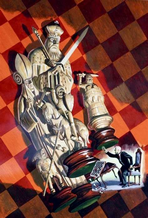
Today we’re talking about George Wilson, a master of painted comic book covers who brought a cinematic flair to newsstands across America during the Silver Age of comics. His work, particularly on the Gold Key and Dell comics from the 1960s and 1970s, enraptured me as a child and still does to this day.
Now, I know what you’re thinking. “George who?” Don’t worry; you’re not alone. Despite his prolific output and undeniable talent, Wilson has somehow managed to fly under the radar for many comic enthusiasts. But believe me, once you see his work, you’ll wonder how you ever missed it.
So let’s jump into the fantastic worlds created by George Wilson’s brush. From prehistoric jungles to distant galaxies, Wilson’s art transported readers before they even cracked open a comic. Let’s explore the life, work, and legacy of this unsung hero of comic book artistry.
Who Was George Wilson?
Before we dive into Wilson’s incredible artwork, let’s take a moment to get to know the man behind the brush. George Wilson was born in 1921 and lived until 1999. A California native, Wilson made his mark on the comic book industry during its golden years, working primarily from the 1950s through the 1970s.
What’s fascinating about Wilson is that he wasn’t your typical comic book artist. Unlike many of his contemporaries who both penciled and inked interior pages, Wilson focused exclusively on creating cover art. And boy, did he create a lot of it! Over his career, he painted hundreds of covers for major publishers like Dell Comics and Gold Key Comics.
Despite his immense talent and the sheer volume of his output, Wilson was known for being remarkably humble about his work. It’s a trait that might explain why he isn’t as widely recognized as some of his peers. But make no mistake, his impact on the industry was significant, and his work continues to captivate comic fans to this day.
The Wilson Touch: A Unique Artistic Style
Now, let’s talk about what made George Wilson’s art so special. When I first laid eyes on a Wilson cover, I was struck by how different it looked from the typical comic book art of the era. While many covers featured bold, graphic designs with flat colors, Wilson’s work was more like looking at a movie poster or pulp novel cover.
Wilson’s style was characterized by several key elements:
- Realism: Unlike the exaggerated anatomy often seen in superhero comics, Wilson’s figures looked like real people. They were athletic and dynamic, sure, but they had a believable quality that made the scenes feel more immersive.
- Action and Drama: Wilson had a knack for capturing moments of intense action or high drama. His covers often featured characters in mid-motion, creating a sense of energy and excitement that practically leapt off the page.
- Attention to Detail: Whether he was painting a historical scene or a futuristic landscape, Wilson’s attention to detail was impeccable. From period-accurate costumes to intricate spaceship designs, his covers rewarded close inspection.
- Masterful Use of Color: Wilson’s color palette was rich and varied. He used color not just to make his covers eye-catching, but to set mood and atmosphere. The warm, golden hues of a Tarzan cover contrasted beautifully with the cool blues and purples of a Star Trek scene.
- Cinematic Composition: Many of Wilson’s covers had a cinematic quality to them. He used perspective and framing techniques that made readers feel like they were looking at a still from a big-budget movie.
One thing that always impressed me about Wilson’s work was his versatility. In one cover, he’d be painting a prehistoric scene with dinosaurs chasing cave-dwellers. In the next, he’d be depicting a far-future battle between humans and robots. And he tackled each subject with equal skill and enthusiasm.
I’ve often wondered how Wilson achieved such consistent quality across such a wide range of subjects. Some sources suggest that he used models for his figures, possibly even using himself as a reference. Whatever his methods, the results speak for themselves.

From Dell to Gold Key: Wilson’s Comic Book Journey
As mentioned above, George Wilson’s comic book career is primarily associated with two major publishers: Dell Comics and Gold Key Comics. Let’s take a closer look at his work for these companies and some of the iconic series he contributed to.
Dell Comics (1950s-1962)
Wilson’s journey in comic book cover art began with Dell Comics in the 1950s. Dell was known for its licensed properties, adapting popular TV shows, movies, and cartoon characters into comic book form. This gave Wilson the opportunity to work on a wide variety of subjects right from the start.

Some of the notable Dell titles Wilson created covers for include:
- Tarzan of the Apes: Wilson’s Tarzan covers are among my personal favorites. He captured the raw power and grace of the jungle hero, often pitting him against fearsome animals or human adversaries in lush, detailed jungle settings.
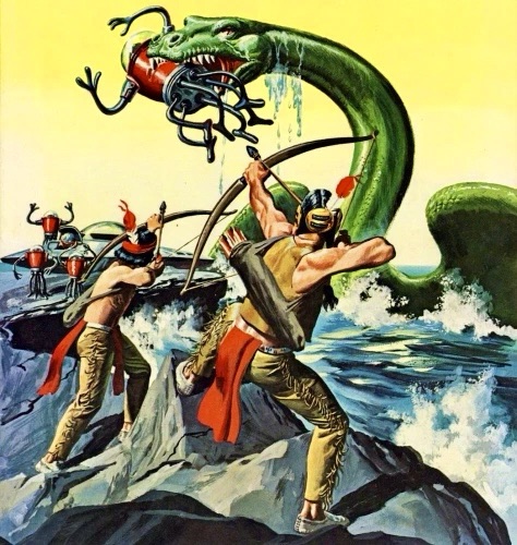
- Turok, Son of Stone: This series about a Native American warrior trapped in a lost valley of dinosaurs was perfect for Wilson’s talents. His dinosaur paintings were particularly impressive, rivaling anything you’d see in scientific illustrations of the time.
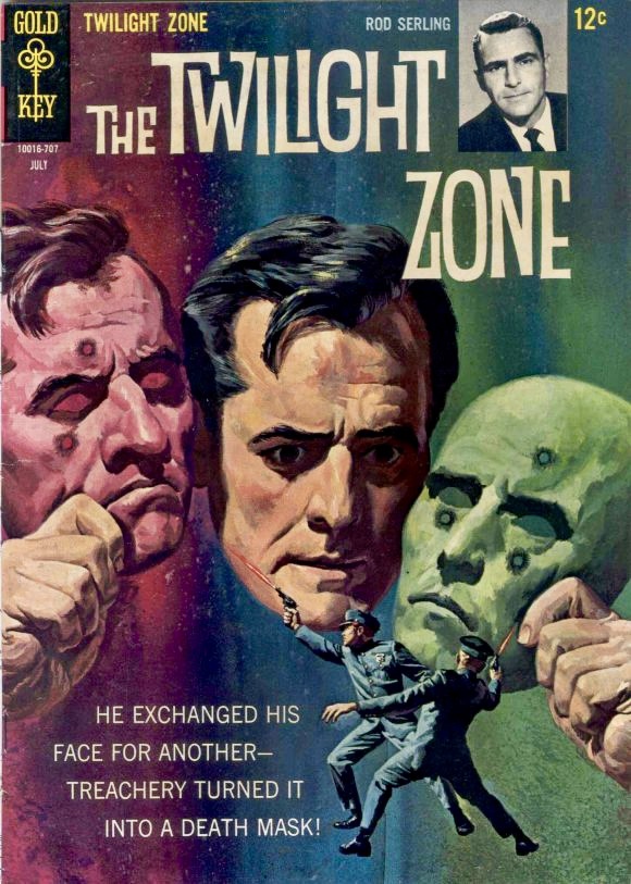
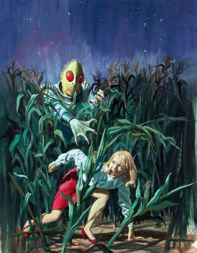
- The Twilight Zone: Wilson’s covers for this series based on the popular TV show perfectly captured its eerie, supernatural vibe. Each cover was like a mini-mystery, hinting at the strange tale within.

Gold Key Comics (1962-1984)
When Western Publishing ended its partnership with Dell and formed Gold Key Comics in 1962, Wilson moved with them. It was at Gold Key that Wilson would produce some of his most memorable and collectible work.
Here are some of the standout series Wilson worked on at Gold Key:
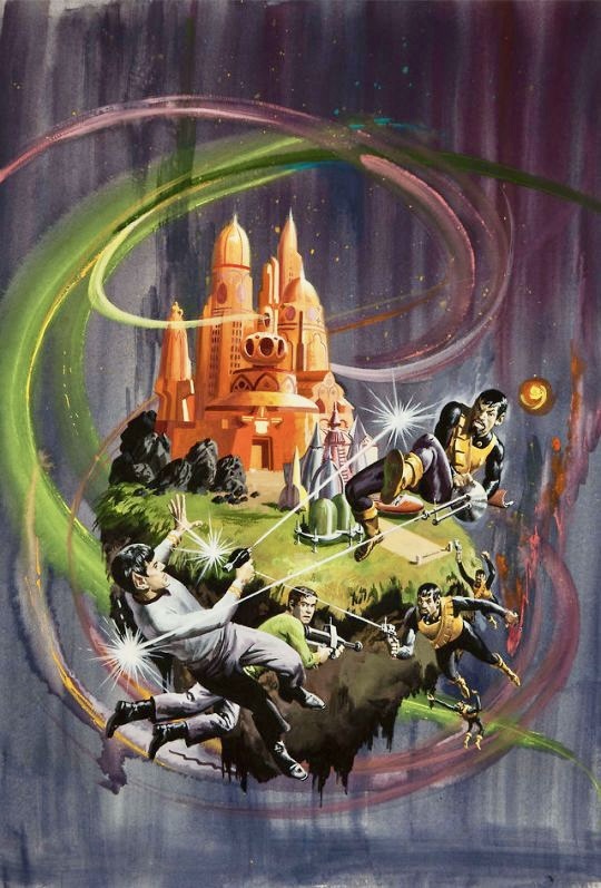
- Star Trek: Wilson painted 32 covers for Gold Key’s Star Trek series, and they’re absolute classics. He perfectly captured the sense of wonder and adventure that made the show so popular, often featuring the Enterprise crew facing off against alien threats or exploring strange new worlds.
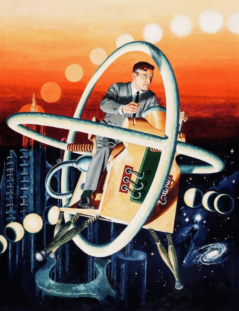
- Magnus: Robot Fighter: This series about a hero battling rogue robots in the year 4000 A.D. was tailor-made for Wilson’s talents. His futuristic cityscapes and dynamic robot designs were a sight to behold.
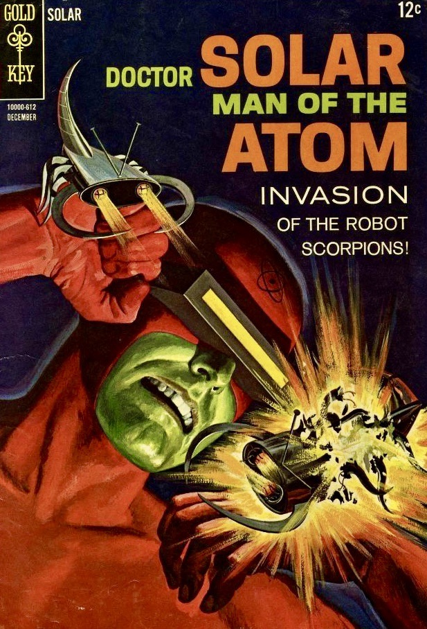
- Doctor Solar, Man of the Atom: Wilson’s 13 covers for this superhero series showcased his ability to blend science fiction elements with superhero action.
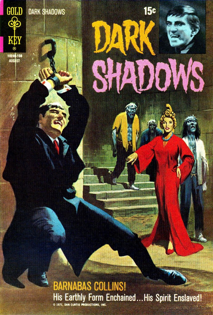
- Dark Shadows: Based on the gothic soap opera, Wilson’s 22 covers for this series dripped with atmosphere and supernatural menace.
- Space Family Robinson/Lost in Space: Wilson created over 50 covers across various titles featuring this sci-fi family, showcasing his talent for both character work and imaginative alien landscapes.

An Unsung Comic Book Great
Despite his incredible output and the high quality of his work, George Wilson has been somewhat underappreciated in comic book history. But among artists and dedicated fans, his influence is undeniable. For example, renowned comic artist Joe Jusko has cited Wilson as a major inspiration for his own painted cover work.
Wilson’s covers stood out on crowded newsstands, often outshining the interior art of the comics they graced. They didn’t just sell comics; they fired imaginations and transported readers to other worlds before they even opened the book.

The good news is that Wilson’s work is starting to get the recognition it deserves. A comprehensive art book titled “The Art of George Wilson” is set to be released in early 2025, featuring over 300 examples of his cover art. I, for one, can’t wait to get my hands on it.
Coda
As I hope I’ve conveyed throughout this post, George Wilson was more than just a comic book cover artist. He was a master storyteller who could capture an entire narrative in a single image. His work spanned genres, from prehistoric adventure to space opera, from gothic horror to superhero action, and he approached each with equal skill and enthusiasm.
Wilson’s legacy serves as a reminder of the power of cover art in the comic book medium. In an era before graphic novels and comic shops, it was often the cover that made the sale, and few could craft a cover as compelling as George Wilson.
So the next time you’re browsing through back issues at a comic shop or convention, keep an eye out for that distinctive Wilson style. You might just discover a new favorite artist – one who’s been hiding in plain sight all along.


Discover more from Fear Planet
Subscribe to get the latest posts sent to your email.

Hi, HERM.
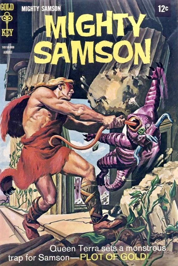
My name is James Cummings out of Boston. Thank you for spotlighting Anthony Taylor’s upcoming book on the art of George Wilson. I’m 66, and grew up with GW’s GOLD KEY covers in the late ’60’s, early 1970’s. (Which later became WHITMAN.) I decided to start officially reading and collecting comics at the age of 10 & 1/2 in 1968. One of the FIRST newsstand purchases of a Gold Key comic you have actually posted here… it’s the issue of MIGHTY SAMSON where he is swinging a mutant beast by its tongue into a stone pillar, titled “Plot of Gold.” I bought it at a Woolworth’s store.
When I read other titles from (mostly) DC, Marvel, or Charlton comics, those were available in most any store. But Gold Key Comics you could ONLY find at Woolworth’s which made them more special. And yes, seeing the comic characters looking so realistic, (unlike the pen and ink drawings of, say, Superman or Batman,) really was a mind-blowing introduction into the world of illustration and illustrators.
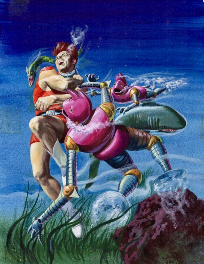
A quick note about that Woolworth’s — the following year, in that same store, during the summer of 1969, I purchased another GK issue GW covered. It’s the illustration of Magnus, Robot Fighter, struggling underwater with the 2 maroon robots, (with propellors for feet,) attacking him. That story was titled “Panic in Pacifica.”
You are correct in saying George used models for reference. His favorite was actor Steve Holland, who was used by just about every magazine and paperback artist in the 1960’s. (Also, the 1950’s, through the early 21st century! He passed away a few years ago.)
George also used himself as a model many times for his Gold Key / Whitman illustrated covers. You actually posted him on a Twilight Zone cover above. (He’s the guy holding the 2 Death masks, looking down on the 2 cops.) This was painted around 1966. George’s hair was black then. I met him in 1983, and it was white. But you can see lots of “self-portraits” with both hair colors.
Your article has reminded me of something I once said to him. (Sort of along the lines of George’s Black / White hair.) I said it was cute that he always mixed the color of Magnus, Robot Fighter’s BOOTS. In the comic book interior art by Russ Manning, (and later, Paul Norris,) the boots were CONSISTENTLY white. As you can see from the origin of Magnus painting, the boots are black. But he’d regularly alternate. (They are white on the cover of MRF #27.)
I also believe that George developed specific cult followings from both the TARZAN (ERB), and PHANTOM camps, because of his beautiful GOLD KEY covers of both characters.
Lastly, you made a very common mistake with the images you posted. It can be VERY tricky to I.D. illustrations that were NOT actually done by George. You have done admirably! There are only TWO paintings that I don’t think are GW’s. #1 is that later cover of the scuba diver breaking into the wall safe of the sunken Yacht, with the ghost of the Yacht Captain materializing behind the diver. Parts of the picture, (like the money and jewelry from the safe,) have that detail George was always a master of. But there are other parts of the picture that make me think this might be another illustrator. (Like Sam Savitt, who, like George, also worked for Dell in the 1950’s.)
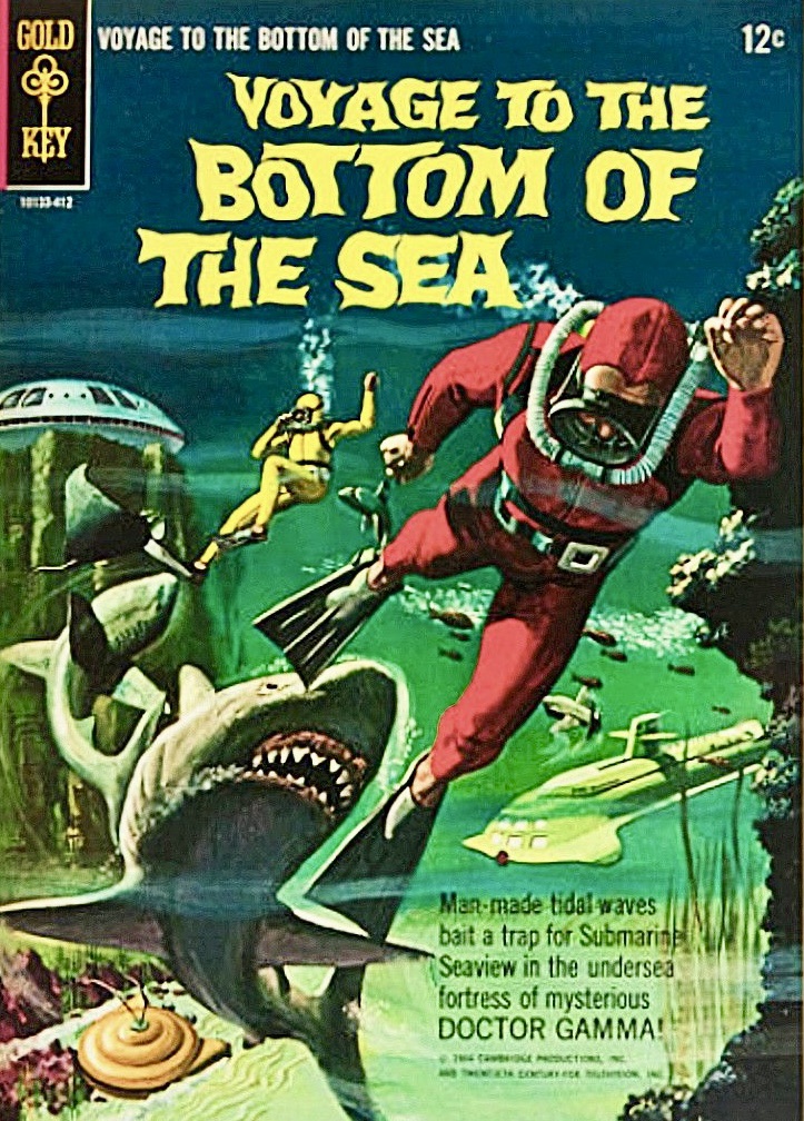
The SUPERCAR under the sea illustration I’ve seen has already been credited to another artist. It really is well done. But also keep in mind that Gold Key used other illustrators for some of the GK adventure line. GW did ALL of the Space Family Robinson covers throughout the 1960’s. But George traded off with artist Vic Prezio on Magnus, Robot Fighter, 4000 A.D. And Morris Gollub did some of the early issues of Mighty Samson.
Feel free to contact me at “jammings123@hotmail.com” I could show you some other examples of George’s covers where he used himself for a model. I have a lot of other scans by George, and I’m always happy to share.
All the Best,
Jim Cummings
LikeLike
Hi, James. Thanks for the corrections and the informative commentary, and I would absolutely LOVE some scans of George’s art, which I will publish on the site with credit given to you.
Regarding the ‘Death Ship’ illustration, I got the information off a Grand Comic Database entry. It is possible that they might be in error. The Supercar cover had no artist credited, so I assumed it was George, since it looks like his style, but I should do further research.
Much appreciated!
LikeLike
Hi Herm,
I just sent you an email, but it didn’t transmit.
Sorry for the lag in response time. Glad to send you samples of GW’s work, but I’d like to wait until Anthony Taylor publishes his book next month, to see what he DOESN’T include in it. (Amazon does keep moving up that release date.)
How do I email you scans that you can post here?
Signed, Wondering
(Jim Cummings)
LikeLike