

When I first discovered 2000AD as a pre-teen, I was immediately struck by how different it looked from any other comic I’d encountered. There was something electric about those pages—a raw energy and visual boldness that set it apart from both American superhero comics and traditional British fare. Today, I want to dive into what makes 2000AD’s visual identity so distinctive and how it revolutionized comic art in the UK.
Breaking Away from British Comic Traditions
The visual revolution of 2000AD didn’t happen by accident. It was a deliberate rebellion against the status quo of British comics in the 1970s. Pat Mills, the visionary behind the publication, had grown frustrated with the soft, conservative art styles dominating the UK scene.
Mills wanted something edgier, more dynamic—something that would grab young readers by the eyeballs and refuse to let go. He wasn’t interested in creating just another comic; he wanted to forge something revolutionary that would stand apart visually from everything else on the newsstand.

The European Art Invasion
The secret weapon in 2000AD’s visual arsenal? European artists. While working on his previous title Action, Mills had been exposed to the sophisticated artwork coming out of continental Europe, and he was determined to bring that sensibility to his new project.
In a bold move that would forever change British comics, Mills actively recruited European illustrators. The early issues of 2000AD featured more European artists than British ones—a dramatic departure from industry norms that immediately set a new visual standard.
These European artists brought different sensibilities, techniques, and visual languages that British readers simply weren’t accustomed to seeing. The result was artwork that felt fresh, challenging, and uniquely suited to the sci-fi dystopian worlds that would become 2000AD’s trademark.
The Unsung Hero: Doug Church and Dynamic Layouts
While the European artists provided the raw talent, there was another crucial figure working behind the scenes to shape 2000AD’s distinctive look: Doug Church. As a layout artist, Church took the European artwork and transformed it through innovative page designs that amplified its impact.
Church added elements like:
- Striking header images
- Circular focal points surrounded by smaller panels
- Varied panel sizes to create rhythm and emphasis
- Dynamic composition that guided the reader’s eye
In Church’s own assessment, the European artists “simply weren’t capable of the necessary dynamism” on their own. His contributions—arranging their exceptional artwork into kinetic, engaging layouts—was what truly brought the pages to life. This “alchemic ability” to enhance the European art style with bold layouts contributed enormously to the comic’s visual success.

The Artists Who Defined an Era
No discussion of 2000AD’s visual style would be complete without highlighting some of the key artists who shaped its identity:
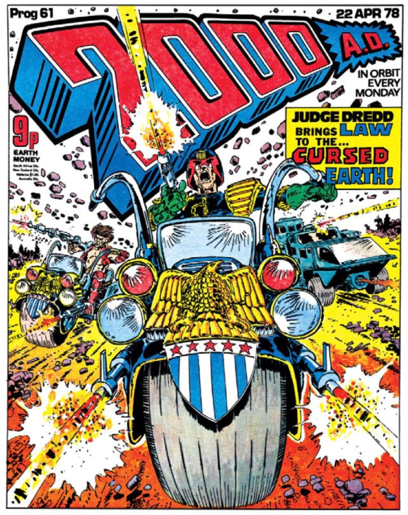
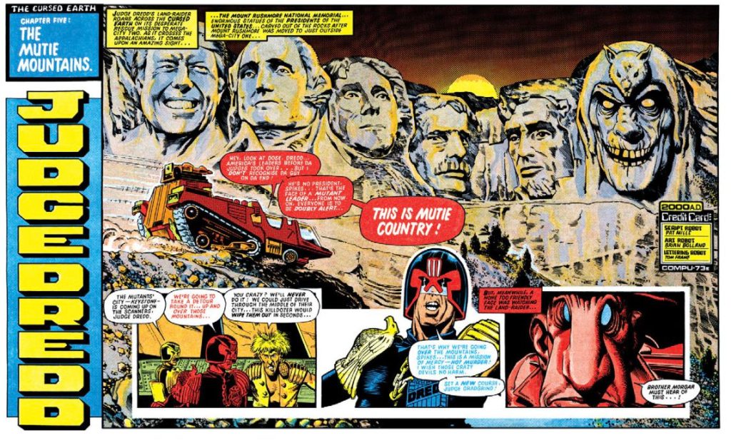
Carlos Ezquerra: The Father of Dredd
Spanish artist Carlos Ezquerra created what would become 2000AD’s most iconic character: Judge Dredd. Everything from Dredd’s eagle-shouldered uniform to his Lawgiver gun and Lawmaster bike emerged from Ezquerra’s imagination. His vision extended beyond the character to the very world of Mega-City One itself.

Ezquerra’s style—with its strong blacks, exaggerated proportions, and gritty textures—perfectly captured the dystopian future that became 2000AD’s signature setting. His “zazzy” approach to art, based on Church’s dynamic layouts, helped establish the comic’s bold visual direction.

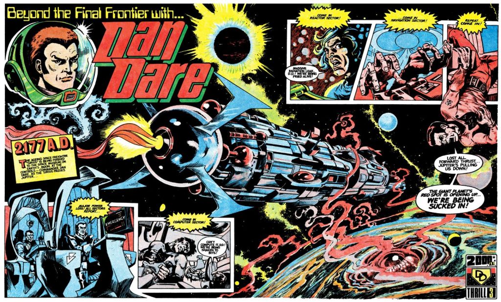
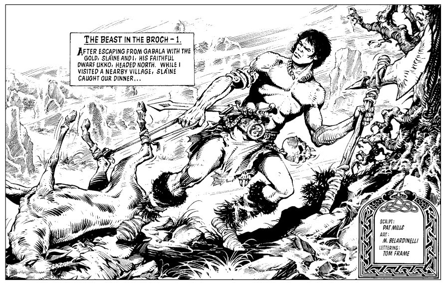
Massimo Belardinelli: The Weird Visionary
Italian artist Massimo Belardinelli brought his distinctive style to strips like Dan Dare. While sometimes described as “weird,” Belardinelli’s surreal aesthetic and incredible attention to detail added another dimension to 2000AD’s visual tapestry.

His organic forms, intricate backgrounds, and unconventional approach to anatomy made his work instantly recognizable and contributed to the sense that 2000AD was showing readers things they couldn’t see anywhere else.
Technical Innovation and Editorial Vision
The revolutionary look of 2000AD wasn’t just about the artists’ pens—it was also crafted through technical innovation and editorial guidance. Art editors like Jan Shepheard and assistants like Kevin O’Neill employed various techniques to refine and elevate the artwork:
- White paint corrections
- Paste-up techniques
- Strategic enlargement of key panels
- Copy manipulation to enhance dramatic effect
These behind-the-scenes interventions helped maintain a consistent level of quality and visual impact across different strips and artists.

Breaking the Panel: New Approaches to Page Design
Perhaps the most visible departure from traditional British comics was 2000AD’s approach to page design. Gone were the uniform, grid-like panels that had dominated UK comics for decades. In their place came:
- Dramatic half-page images
- Large, scene-setting intro frames
- Three-frame double-page spreads that created a cinematic feel
- Varied panel shapes that enhanced storytelling
This approach prioritized dynamic action and visual impact over the more static, text-heavy approach of traditional British comics. It created a sense of movement and energy that perfectly complemented the futuristic, action-packed stories.

The Legacy: How 2000AD Changed Comics Forever
The visual style pioneered by 2000AD in the late 1970s didn’t just make for a successful comic—it fundamentally changed the visual language of British comics and influenced generations of artists worldwide.
The “all-star” approach championed by Mills, where every strip needed to be visually striking enough to be someone’s favorite, raised the bar for comic art everywhere. Artists who cut their teeth at 2000AD, like Brian Bolland, Dave Gibbons, and Kevin O’Neill, would go on to revolutionize American comics as well.


Today, looking at a page from early 2000AD, I’m still struck by how modern it feels. That’s the mark of truly revolutionary design—it doesn’t just look good for its time; it creates a new standard that endures for decades.
The next time you pick up a copy of 2000AD, take a moment to appreciate not just the stories, but the visual revolution happening on every page—a revolution that forever changed what comics could look and feel like.
Discover more from Fear Planet
Subscribe to get the latest posts sent to your email.
