
I’ll be brutally honest—until a couple of years ago, I’d never even heard of Henri Lievens. And that’s a damn shame, because this Belgian master created some of the most hauntingly beautiful horror and science fiction cover art of the 20th century. While everyone was fawning over the American pulp artists (don’t get me wrong, I love them too), Lievens was quietly revolutionizing genre illustration across the Atlantic with a gothic sensibility that would make Edgar Allan Poe weep with joy. And now he’s one of my all-time favorite artists.
Born in Antwerp on April 10, 1920, Lievens didn’t stumble into illustration by accident. He trained at the Royal Academy of Fine Arts in Antwerp, grounding himself in traditional painting techniques that would later elevate his commercial work far above typical paperback fodder. By 1946, at just 26, he was already making waves with his illustrations for K.C. Peeters’ “Eigen Aard.” But the real magic began in 1955 when he joined Éditions Marabout in Verviers.
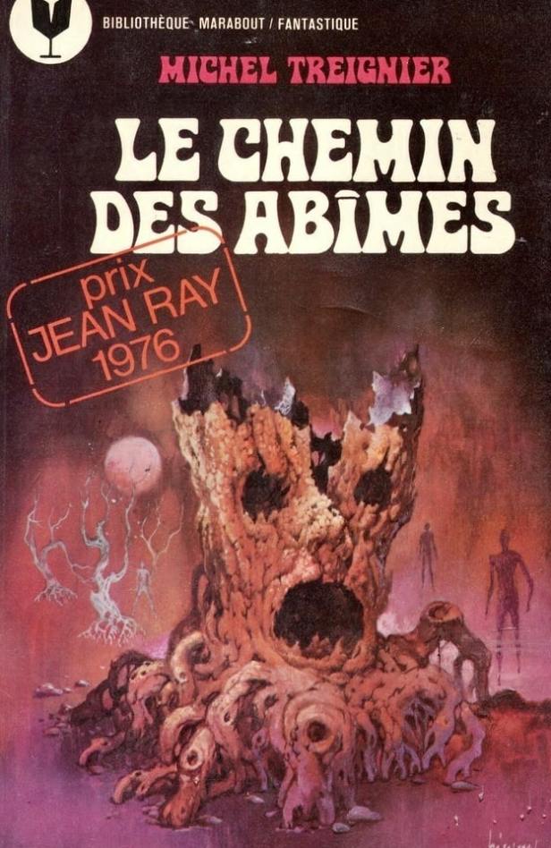
Now, here’s where things get interesting (and where I start getting genuinely excited about this guy’s work). For over two decades—1955 to 1977—Lievens created more than 200 covers for Marabout’s various collections. Two hundred! That’s not just productivity; that’s sustained artistic excellence under commercial pressure. Most artists would burn out or start phoning it in, but Lievens kept pushing boundaries.
The Marabout Revolution
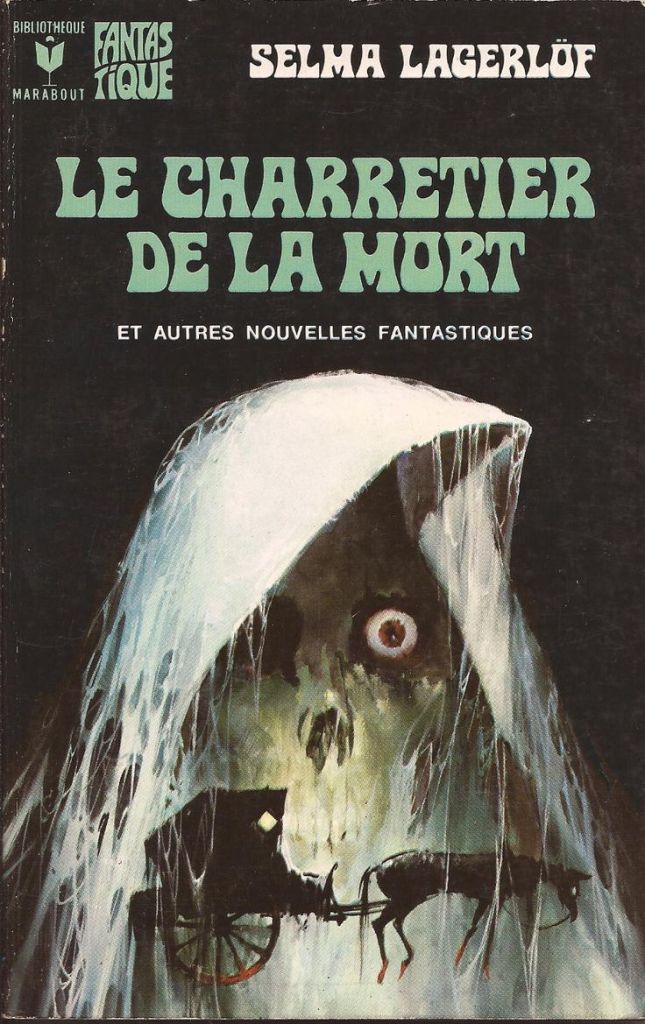
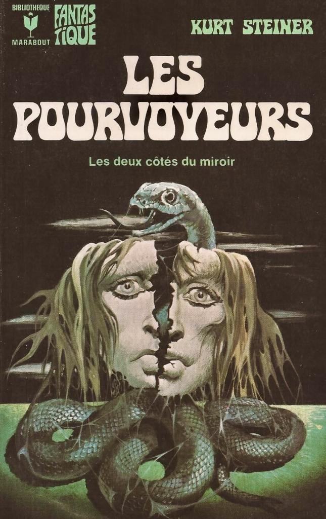
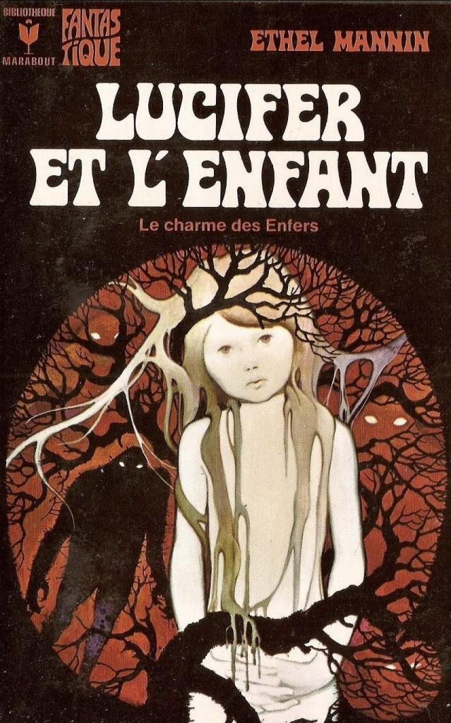
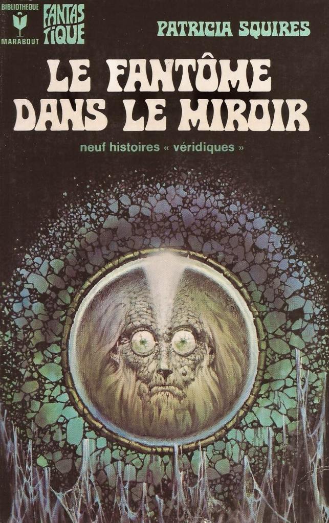
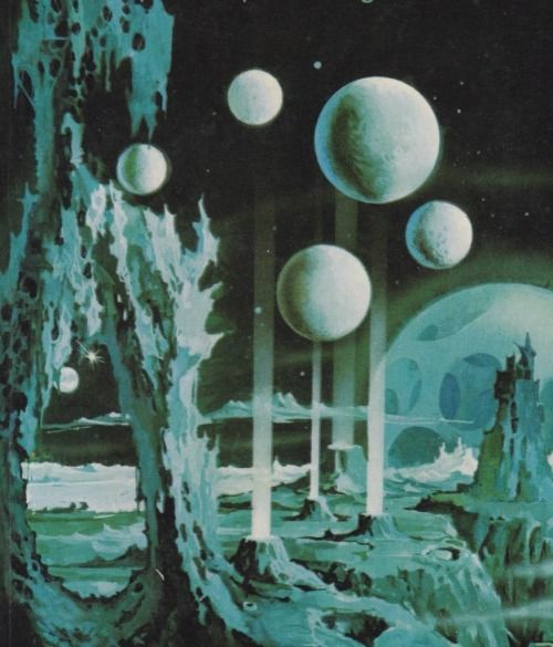
The Marabout Fantastique and Science-Fiction collections weren’t just book series—they were cultural phenomena that introduced European readers to the cream of international genre fiction. And guess whose artwork was guiding readers into these strange new worlds? Our man Henri, painting nightmares and wonders in gouache on cardboard.
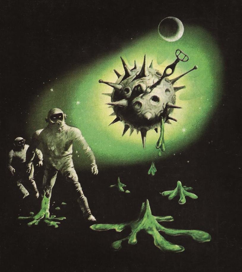
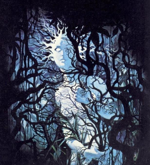
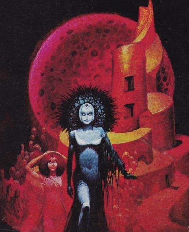
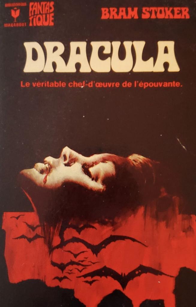
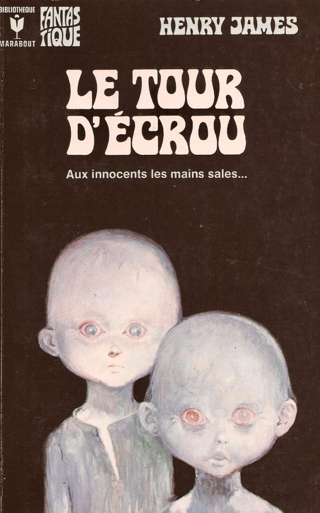
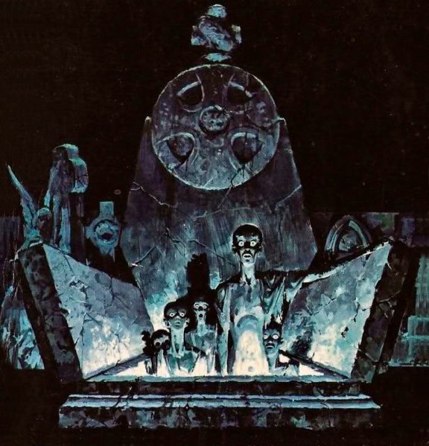
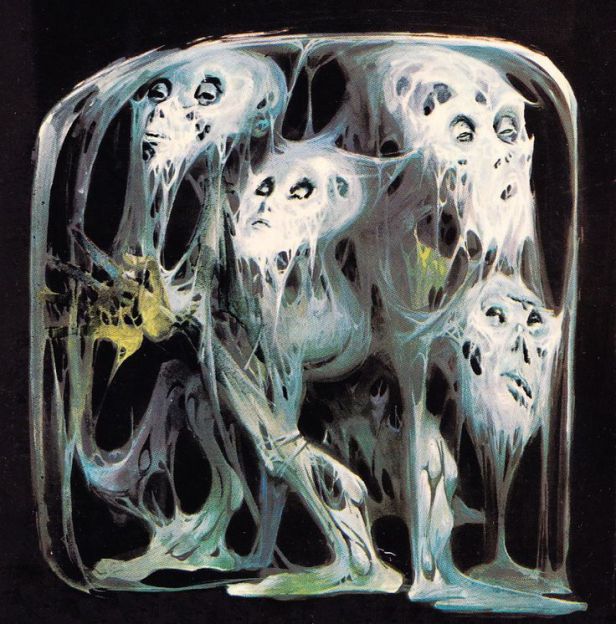
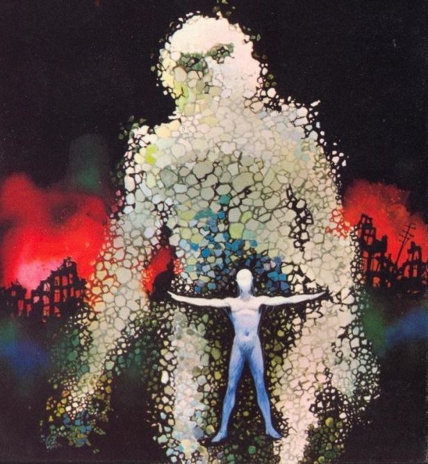
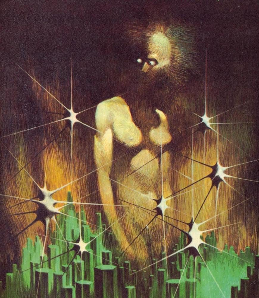
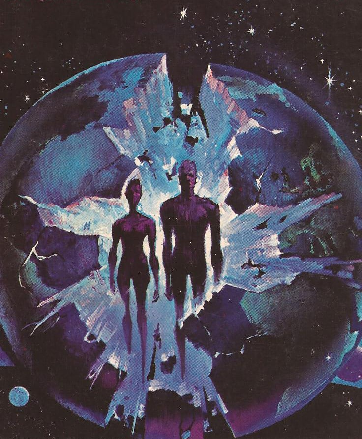
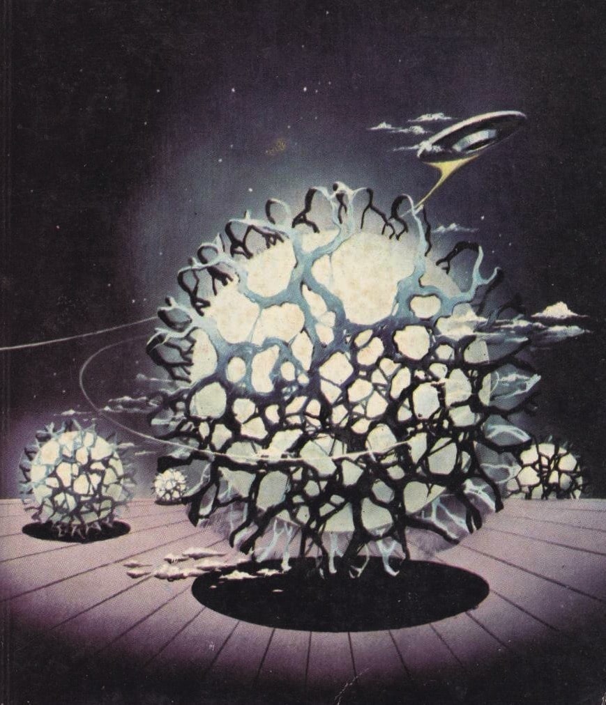
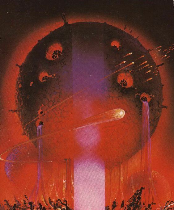
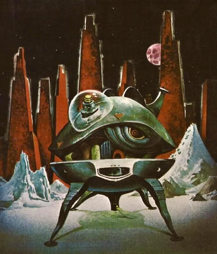
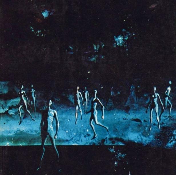
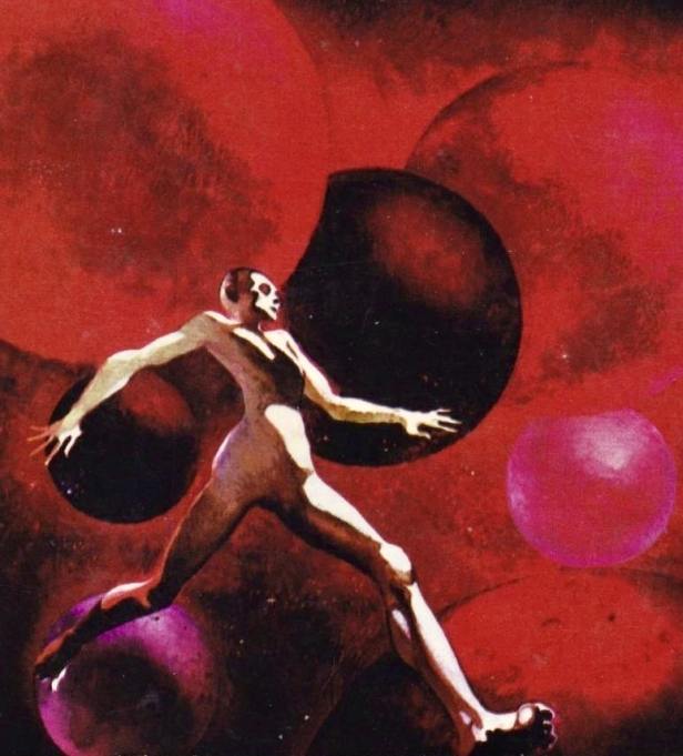
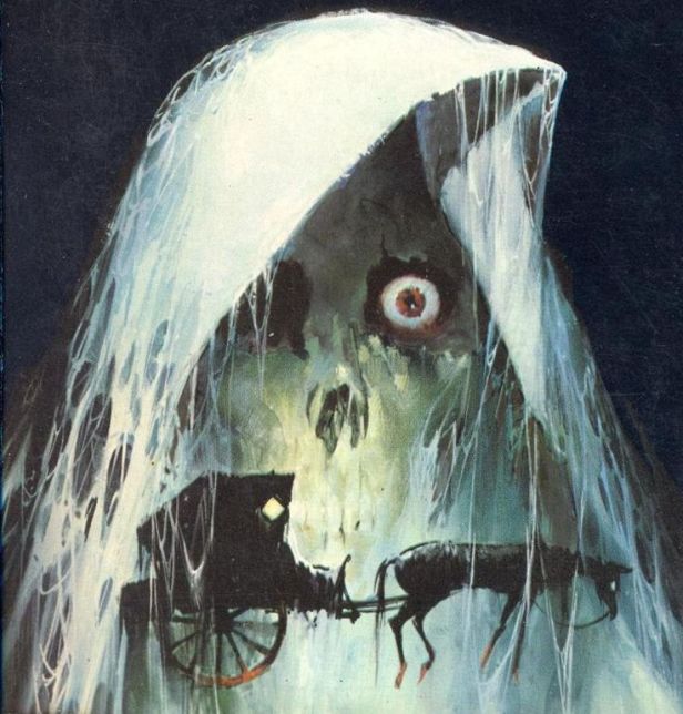
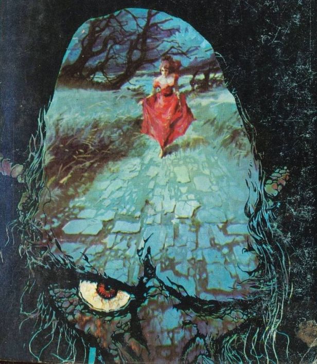
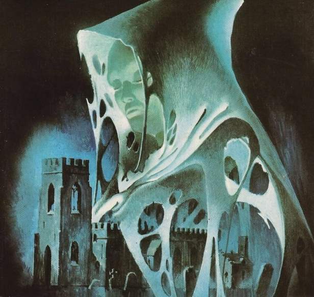
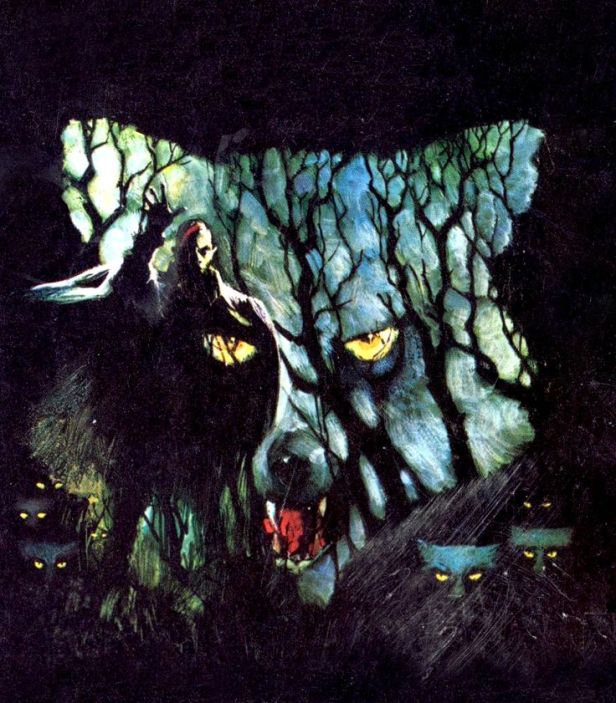
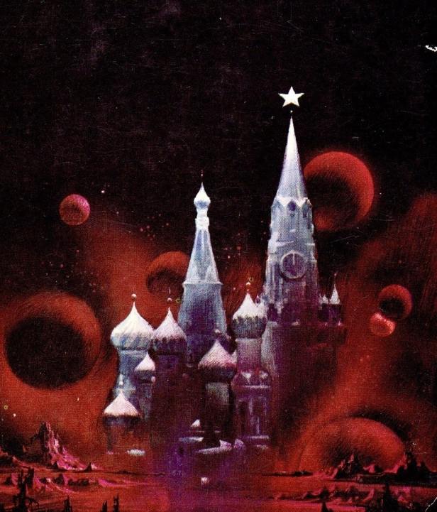
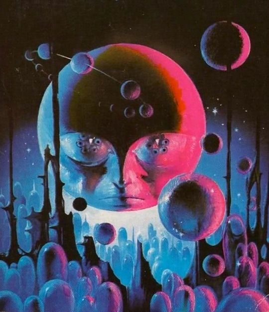
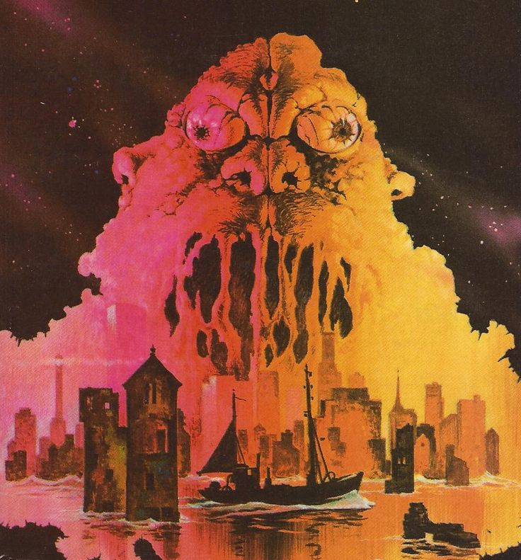
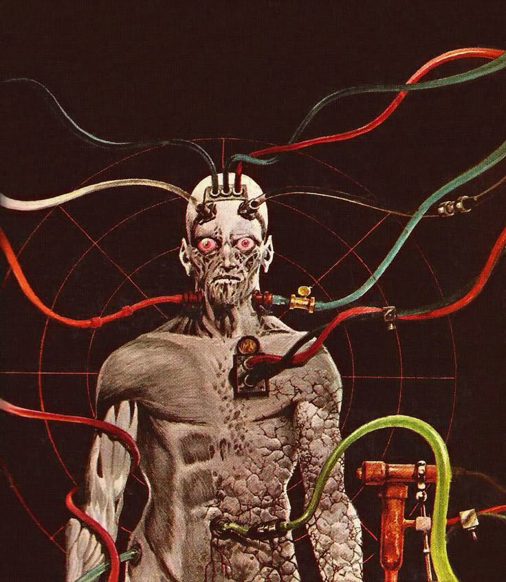
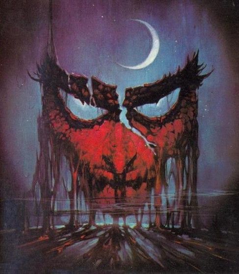
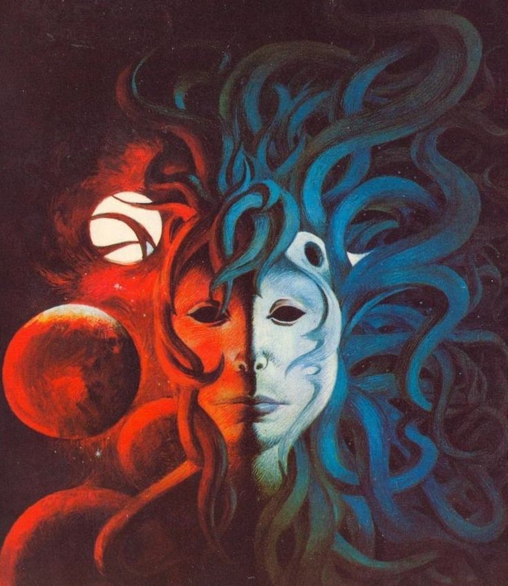
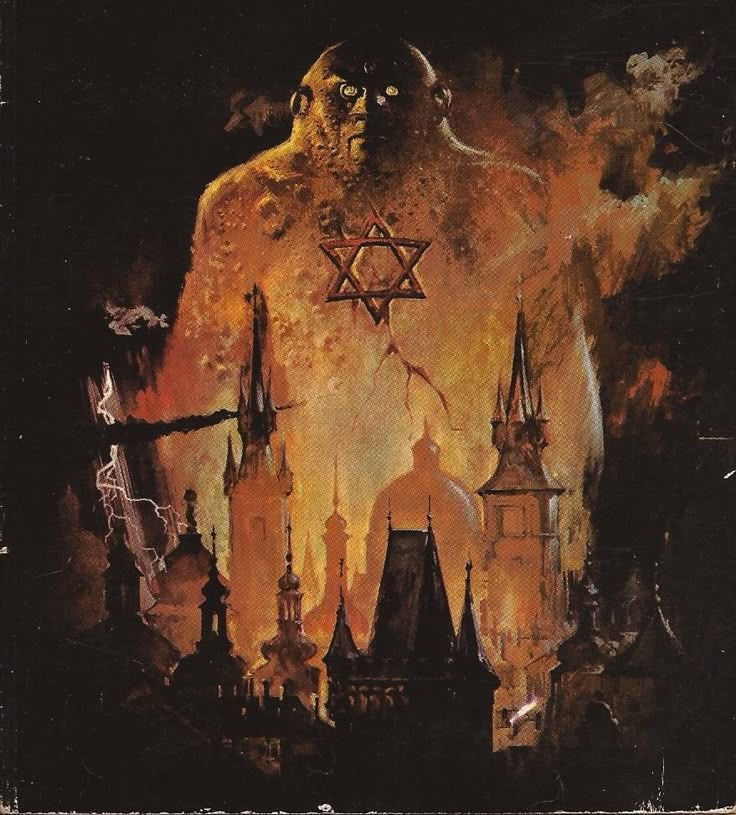
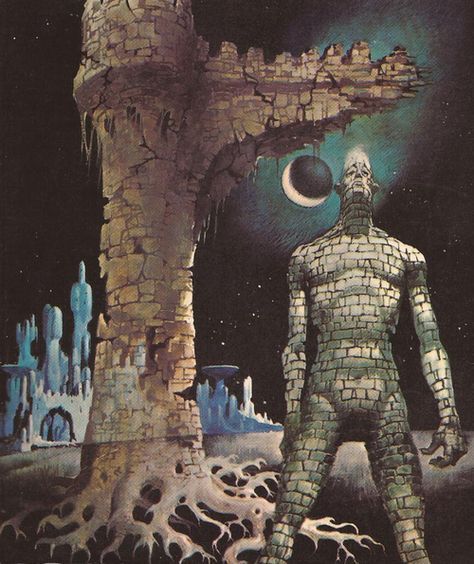
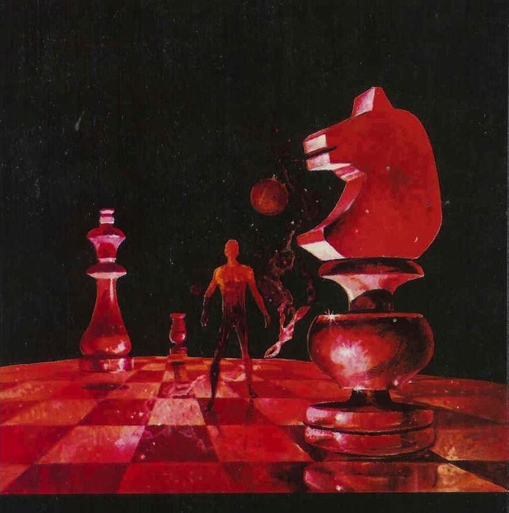
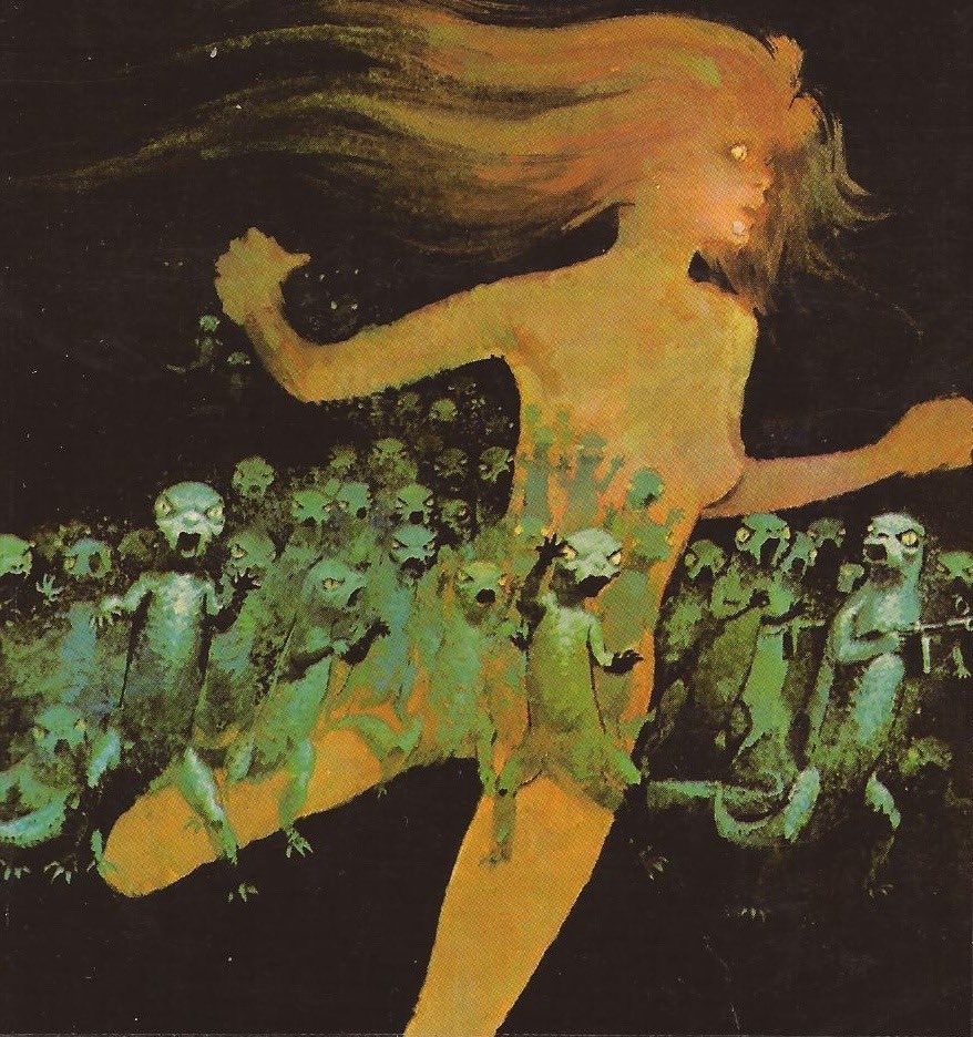
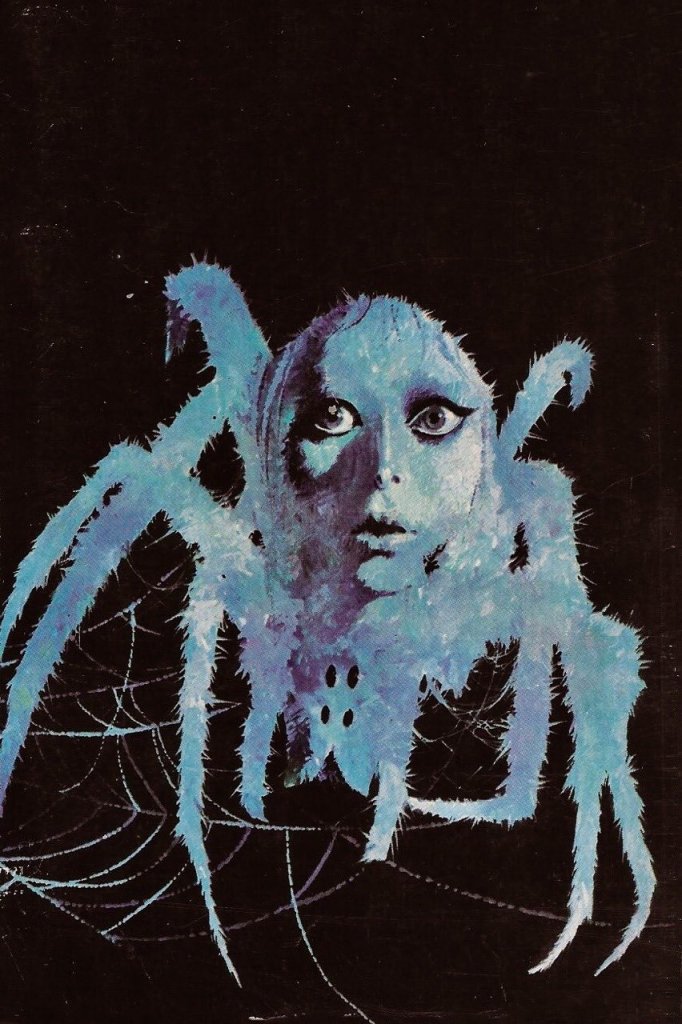
I’ve got to pause here to appreciate what Lievens achieved stylistically. While his American contemporaries were often going for that pulp magazine sensibility (which I adore, mind you), Lievens developed what critics called a “gothic surrealist” style. Picture this: “unearthly purple twilight” backgrounds populated by “demonic forms, half-human and half-spectral” emerging in “cold, unreal light.” The man wasn’t just illustrating stories—he was creating atmospheric poetry with paint.
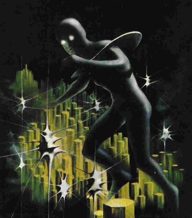
His compositions were described as “psychedelic and brutal,” rooted firmly in 1960s European fantasy aesthetics. (And before you roll your eyes at “psychedelic,” remember this was the era when genre art was finally breaking free from the constraints of earlier decades.) Lievens understood something fundamental: horror and science fiction aren’t just about monsters and spaceships—they’re about mood, about that creeping sense of unease that makes your skin crawl.
Beyond the Fantastic
Here’s what impressed me most about Lievens’ career—his versatility. While he’s rightfully celebrated for his horror and sci-fi covers, the guy was a chameleon. He worked on the Bob Morane adventure novels (those Henri Vernes stories were hugely popular in Europe), creating covers for the first six graphic novel adaptations between 1960 and 1964. He even did photographic montages for the Marabout Flash collection—small-format publications that came out nearly weekly from 1959 to 1967.
The man was also connected to some major international genre properties. He created covers for the Belgian edition of Perry Rhodan (that German space opera series that’s still running today—talk about longevity!) and provided interior illustrations for French translations of Doc Savage novels. Lievens wasn’t just working in a Belgian bubble; he was part of the global conversation in genre art.
The Artist’s Technique
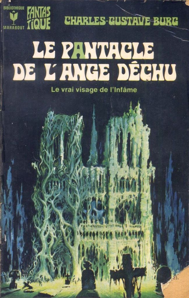
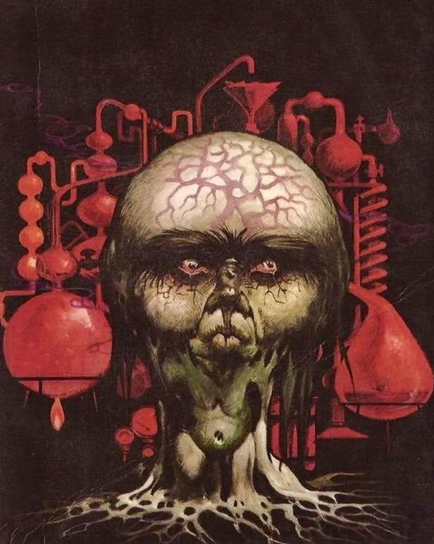
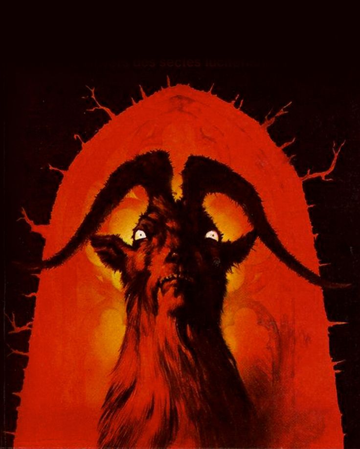
Now, let me geek out about his actual artistic process for a moment. Lievens worked primarily in gouache on cardboard, creating original preparatory designs that showed remarkable attention to atmospheric detail. Contemporary auction descriptions of his work praise the “vivid colors and contrasts,” noting how everything in his illustrations “evokes psychosis, visceral fear and the anguish of passage into the unknown.”
That’s not marketing hyperbole—that’s accurate artistic analysis. Lievens had a gift for making viewers feel uncomfortable in the best possible way. His technique involved heavy impasto and scratching methods to achieve textural effects that jumped off the cover. When you picked up a book with a Lievens cover, you felt the story before you even cracked it open.
His artistic approach combined several distinctive elements:
Dramatic chiaroscuro effects that would make Caravaggio proud—this guy understood light and shadow on a fundamental level. Surrealist imagery that blended realistic and fantastical elements so seamlessly you questioned your own perception. Gothic atmosphere dripping with shadows, mysterious figures, and supernatural dread. Vivid color palettes often dominated by deep purples and blacks with strategic highlights that drew your eye exactly where he wanted it. And cinematic composition clearly influenced by 1960s horror films—you can practically hear the Vincent Price narration when looking at his work.
Working in Shadows
Here’s where the story gets a bit melancholy, and honestly, it pisses me off a little. Throughout his career at Marabout, Lievens worked alongside Pierre Joubert, whose work gained greater recognition and respect. When Joubert left in 1972, Lievens was tasked with retouching Joubert’s existing Bob Morane illustrations—basically cleaning up someone else’s work to make the hero look like actor Claude Titre.
After Joubert’s complete departure in 1973, Lievens finally got to take over as primary cover artist for Bob Morane, though he still had to share the responsibility with William Vance. It’s one of those frustrating “what if” scenarios—imagine what Lievens could have accomplished with full creative control from the beginning.
Legacy and Recognition
Lievens left Marabout in 1977, ending a 22-year run that defined much of European genre art aesthetics. He received recognition during his lifetime, including a Special Prize at the third European Science Fiction Convention, but nowhere near the acclaim he deserved.
When Henri Lievens died on June 22, 2000, in Borgerhout, Antwerp, at age 80, the art world lost a master whose influence extended far beyond his commercial origins. But here’s the beautiful irony—while Pierre Joubert achieved greater fame during their lifetimes, modern collectors and science fiction art enthusiasts have finally started recognizing Lievens’ unique contributions.
The Market Speaks
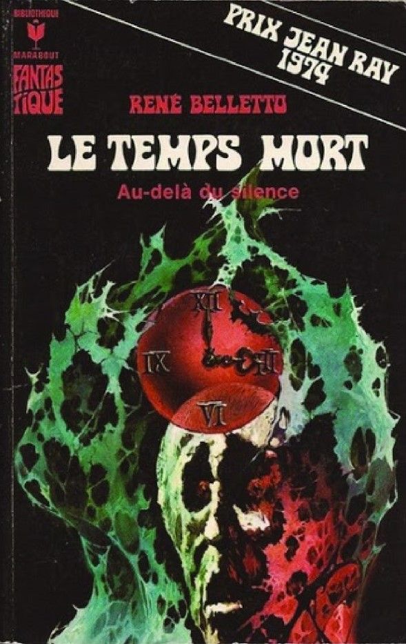
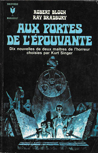
Today’s art market is finally catching up to what should have been obvious decades ago. Original Lievens artwork commands serious attention, with recent auction results showing his gouache paintings selling for €200 to €787. His cover for “Aux portes de l’épouvante” (featuring works by Robert Bloch and Ray Bradbury—now that’s a powerhouse combination) is being called an “absolute masterpiece” and “one of the most striking covers in the Marabout Fantastique collection.”
Galleries and auction houses specializing in comic art and illustration are actively seeking his original preparatory designs. The recognition has grown considerably since his death, with art historians finally acknowledging this “versatile and fascinating artist” who bridged European artistic traditions with the emerging visual language of science fiction and horror.
The Lasting Impact
Henri Lievens’ covers didn’t just sell books; they created expectations. Readers looking at a Lievens cover knew they were about to enter worlds where “eerie moods and pulpy frights” waited around every page turn. He succeeded in “translating the visceral horror and pagan anguish” of the stories he illustrated into compelling visual narratives that enhanced rather than merely advertised the content within.
Working within the commercial constraints of paperback publishing, Lievens maintained artistic integrity and produced works that transcended their utilitarian purpose. His illustrations demonstrate that commercial art, when executed with vision and technical mastery, can achieve fine art status while serving its primary function.
Henri Lievens worked in shadows—both literally in his gothic compositions and figuratively in the art world hierarchy. But shadows have power, and his distinctive voice in science fiction and horror illustration deserves recognition as that of a true master. This Belgian artist’s gothic imagination helped shape the visual landscape of European genre fiction during its golden age, creating atmospheric templates that influenced how readers visualized fantastic worlds long after his active career ended.
The man painted nightmares and made them beautiful. In my book, that makes him a true-blue artistic hero.
*Thanks for reading, Fear Planet denizens! If you want to revisit, save, highlight, and recall this article, we recommend you try out READWISE, our favorite reading management and knowledge retention app. All readers of Fear Planet automatically get a 60-day free trial.
This post was blasted into the social media stratosphere by HopperHQ, the best social media manager out there.
*This post contains affiliate links. Purchasing through them will help support Fear Planet at no extra cost to our readers. For more information, read our affiliate policy.
Discover more from Fear Planet
Subscribe to get the latest posts sent to your email.

Great article. And a lot of very good illustrations I did not know. A proof that Marabout books are not easy to find in France today.
LikeLike